We have an unhealthy addiction to fossil fuels, that much is clear. What’s also clear is that this can’t go on much longer. Exactly how much longer is something the global carbon budget is trying to quantify. If we’d like to keep our atmospheric temperature increase to about 1.5°C above 1990 levels — and we should – we have a certain amount of greenhouse gases left to emit. How fast we use it up is somewhat up to us, but the rules of integration make it clear: the later we start, the harder we’ll have to hit the brakes.
The two major ways to cut our emissions are: using greener energy and just using less energy. So how are individual countries doing? Are they consuming less energy as the need for sustainability became more prevalent? Are they getting their energy from more low-carbon sources? Let’s take a look.
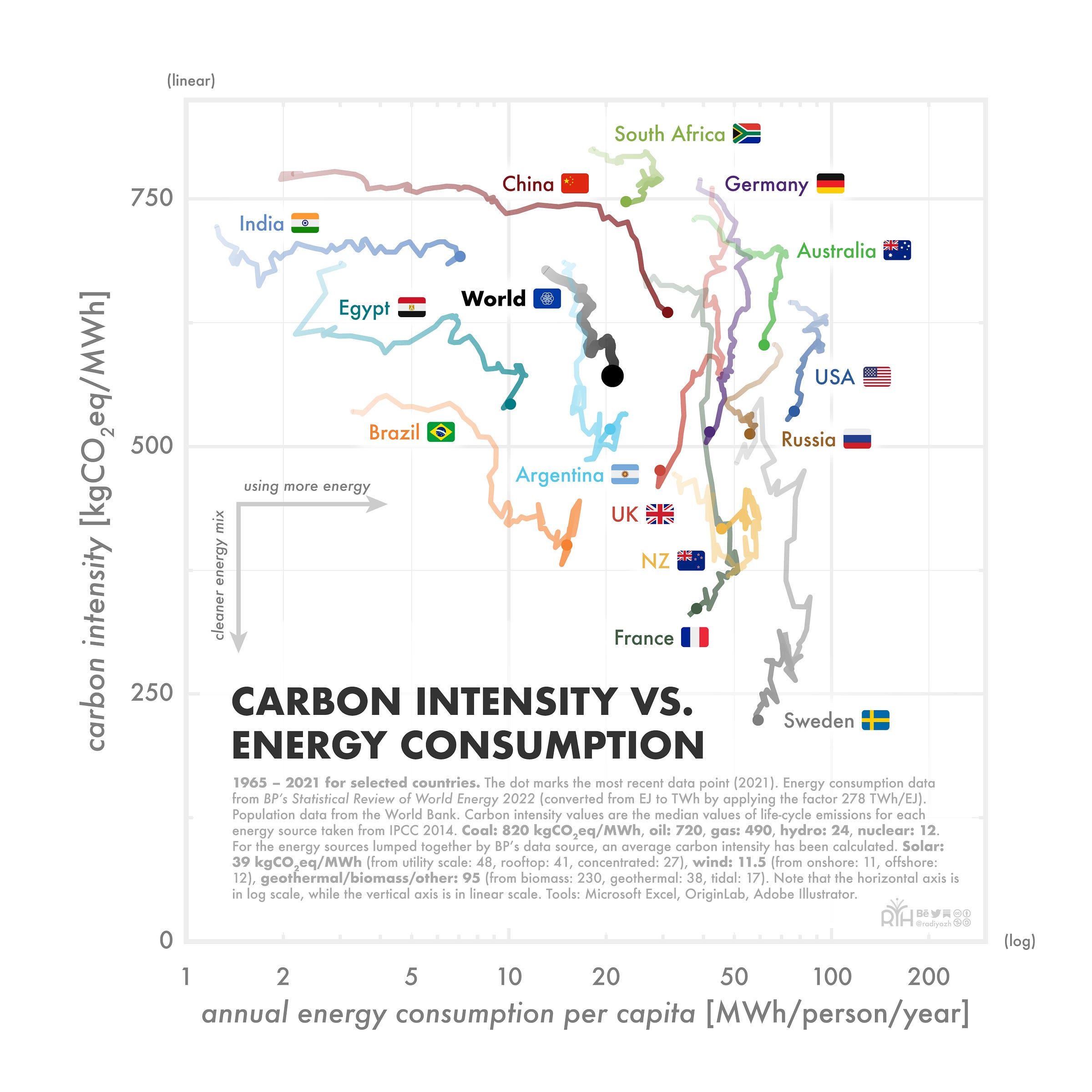
This is a somewhat confusing chart at first. What you are looking at is a plot of the carbon intensity vs. a country’s annual energy consumption per capita. Carbon intensity is measured in how many kilograms of CO2 equivalent each megawatt-hour of consumed energy is responsible for (kgCO2eq/MWh). The energy consumption in turn has units of megawatt-hours per person per year (MWh/person/year). Each trace shows the data range from 1965–2021 for selected countries. The larger dot marks the most recent data point (2021).
The two axes are chosen in such a way to represent the two dominant approaches to getting to net zero: using less energy (consumption, horizontal axis) and using cleaner energy (emissions, vertical axis).
Note that the horizontal axis is a logarithmic scale, while the vertical axis is a linear scale. The logarithmic scale means that moving a certain amount towards the right corresponds to an increase in energy consumption by a certain factor.
Also note that the energy values used are energy consumption, not installed capacity or generation. This is something that OurWorldInData did a nice write-up on, which I highly recommend.
A country’s per capita energy consumption can be seen in the horizontal direction: values further to the right correspond to higher per capita consumption. We can see that countries that are rapidly industrializing move orders of magnitude (log scale!) towards the right in a matter of decades. Apart from some countries in the Middle East (UAE, Saudi Arabia), the United States have one of the highest per capita energy consumption.
A country’s carbon intensity, i.e., how much carbon-equivalent emissions are caused by its energy consumption, is shown on the vertical axis. We can see that countries that reduce their energy from fossil fuels move further down on the graph. Sweden and France are among the countries with the lowest carbon intensity (both heavily rely on nuclear energy), but also New Zealand (hydro and geothermal — carbon intensity is likely overestimated in this plot) and Brazil (hydro) have on average relatively clean energy.
Note that just because a line goes downwards, it doesn’t necessarily mean that a country’s total emissions are going down, too. This also depends on the relative change of energy consumption and emissions, as well as the population development.
What do you think? Should society focus on lowering energy consumption or on getting the energy we use from more sustainable sources?
Share your thoughts in the comments! ⬢
Methods
Energy consumption data is taken from BP’s Statistical Review of World Energy 2022. The data is given in exajoules (EJ), which has been converted to TWh by applying the factor 278 TWh/EJ (this does not take into account inefficiency factors, but for the sake of this comparative overview, that’s fine).
Population data for each year is taken from the World Bank.
Carbon intensity values are the median values of the life-cycle emissions (including albedo effects) for each energy source taken from IPCC 2014. This is technically only for electricity generation, but the best consolidated data I could find. BP’s data source lumps some energy sources together, so an average carbon intensity has been calculated for these groups.
The carbon intensities used for this plot are:
Coal: 820 kgCO2eq/MWh
Oil: 720
Gas: 490
Hydro: 24
Nuclear: 12
Solar: 39 (from utility scale: 48, rooftop: 41, concentrated: 27)
Wind: 11.5 (from onshore: 11, offshore: 12)
Geothermal/biomass/other: 95 (from biomass: 230, geothermal: 38, tidal: 17).
The tools used to make the plot are Microsoft Excel and OriginLab for basic plotting, and Adobe Illustrator to make it look nicer. You are welcome to check out my other work on Behance.
PS: The flag representing Earth is Oskar Pernefeldt’s proposal for an “International Flag of Planet Earth” and I think it looks nice.


hi ! very interesting.
can you open your twitter's DM so we can discuss ?